
Mashup: Progress by Custom Field
The default logic for Progress calculations relies on Role Efforts, Time Spent, Time Remain, and child entities. Even with the ability to define your own logic for the Progress calculation, sometimes having a single Progress bar is not enough.
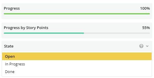
This mashup allows adding a new custom Progress bar to the detailed view. It is based on the value of a custom field which should be between 0 and 1.
Result
Mashup
To be added at Settings -> Mashups with the default footerplaceholder.
The custom field name is defined in line 9.
The header for the Progress bar is defined in line 10.
tau.mashups
  .addDependency('react')
  .addDependency('tau/api/layout-renderer/v1/registerReactComponent')
  .addDependency('tau/api/layout-renderer/v1/LayoutContextConsumer')
  .addDependency('tau/api/layout-renderer/v1/useEntityQuery')
  .addMashup(function(React,registerReactComponent,LayoutContextConsumer,useEntityQuery) {
    //Name of the Custom Field based on which the Progress is calculated
    //The value of this custom field should be between 0 and 1
    const progressCF = `ProgressbyStoryPoint`;
    const progressHeader = "Progress by Story Points";

    registerReactComponent({
      type: `customProgressByPoint`,
      component: function(props) {

        const {
          data,
          isLoading,
          error
        } = useEntityQuery(
          `customProgress:${progressCF}`
        );
        // handle is still loading
        if (isLoading && !data) { // this is the case for initial loading
          return React.createElement("div","Loading...");
        }

        //handle error
        if (error) {
          console.error(error);
          return React.createElement("div","Error");
        }

        //console.log(data);
        const progressValue = Math.round(data.customProgress * 100);

        return React.createElement("div", {className: "layout-renderer__component-container", style: {display: "block"}},
            React.createElement("div", {className: "entity-progress-box entity-progress-box--simple i-role-entity-progress-panel"},
            [
                React.createElement("div", {className: "ui-progressbar__data"},
                [
                    React.createElement("div", {className: "ui-progressbar__data__label"}, progressHeader),
                    React.createElement("div", {className: "ui-progressbar__data__percent"}, progressValue + "%")
                ]
                ),
                React.createElement("div", {className: "ui-progress-bar-progress ui-progressbar__progress"},
                    React.createElement("div", {className: "ui-progress-progress ui-progressbar__progress__indicator", style: {width: progressValue +"%", backgroundColor: "#4cd0a4"}})
                )
                ]
            )
        );
      }});
  });
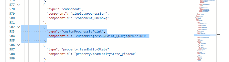
Placing the component into the template
The type of component was defined in the mashup code in line 13.
{
  "type": "customProgressByPoint"
}
Updated 10 months ago